Making Design Lead with


I create the North Star for the product in terms of features; User flow, Business & Tech Architecture


Dive deep into
Brainstorming new concepts within the customer acquisition funnel
What is the problem at hand, user need and business goal?

A legacy subscription configuration
Problem at hand
All of the configurations are unselected and mandatory to go forward.
The configuration is split into two pages, and one requires login.
Poor product explaination
User need
Login being a large roadblock for conversion, for potential customer who want to see final price ex. with coupons, with date and driver's licence restrictions.
Giving the configuration a main stage leads to cognitive load that the user has to configure.
Business Goal
Digital Booking Platform is a means for customer acquisition, so its objective is to convert users into customers or leads.
Why would a design intervention be meaningful in problem solving?
Creating a vision - Configuration
Gather data insights
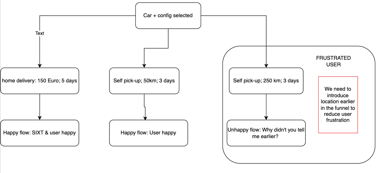
Customers who don't mind any car
Customers who are willing to travel farther to get a particular car
Customers who would get a vehicle delivered
Customers who are willing to wait for a particular car
Brainstorm & propose features
From data, show nearby avalbility of dates, vehicles and locations.
Introduce guest booking (booking without login)
Merge configuration steps into a single page
Remove add-ons
Enable branch ops
Empower the branch up-sell and reduce cognitive load on booking funnel thereby reducing friction
Giving more stage to the car and its attributes
Guaranteed models
Explore vanity features such as vehicle renders and turntables
Free cancellation (no-pay booking)

Creating a vision - Product explaination
User acquisition funnel revamp on mobile with:
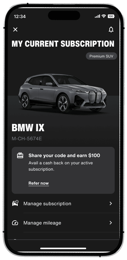
Refer & Earn
Video backgrounds
Snack-able product info cards
Acknowledging different types of user journey
I know what I want - Straight to product
Use case examples
Product comparison
Discover
User types (Car entusiast, Family, Sustainable)
Questionnaire to Offer
Product differentiation
Need analyser / SIXT+ Savings
Customer Testimonial
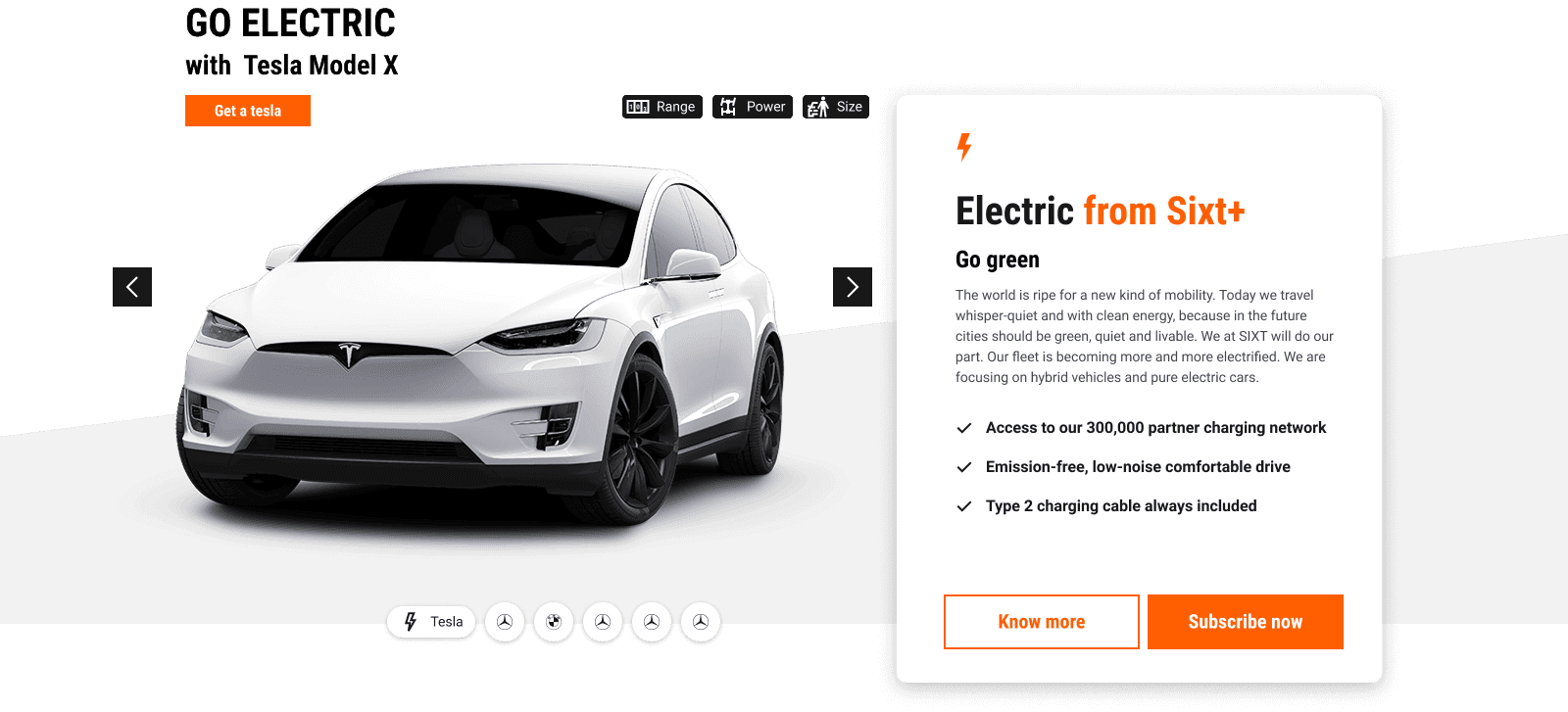
Car of the month
Free cancellation within 24hrs
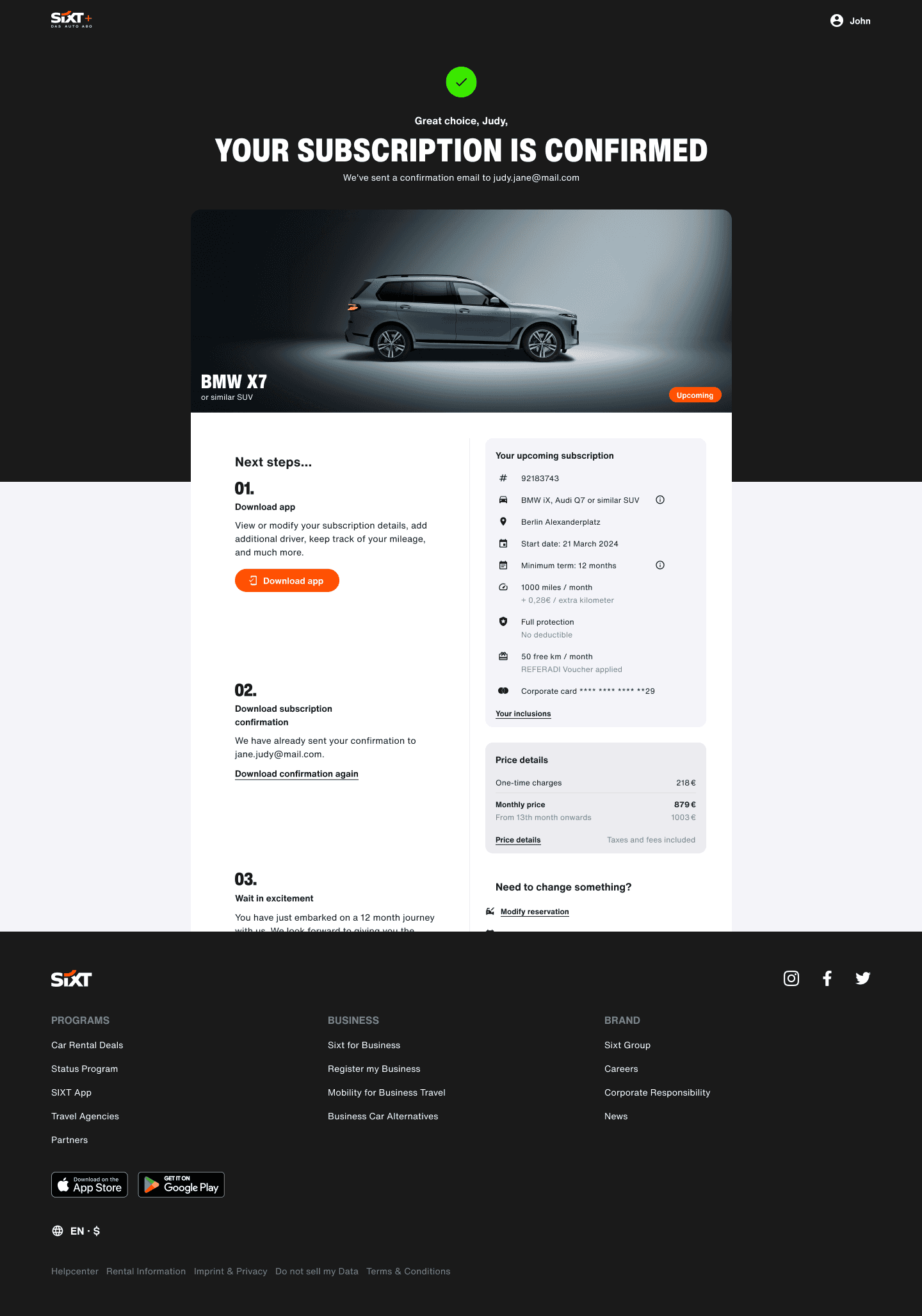
Booking confirmation
How are the features prioritised, the information architecture arranged and presented?

Insights
70% prefer a pick-up within the first 7 days of availability.
93% prefer a pick-up within the first 30 days of availability.
about 25% subscriptions are picked up before the Advance Booking Time threshold.

Insights
95% of users complete the booking within the first 3 days of creating the draft. 83% complete it on the same day.
*Data from Quicksight
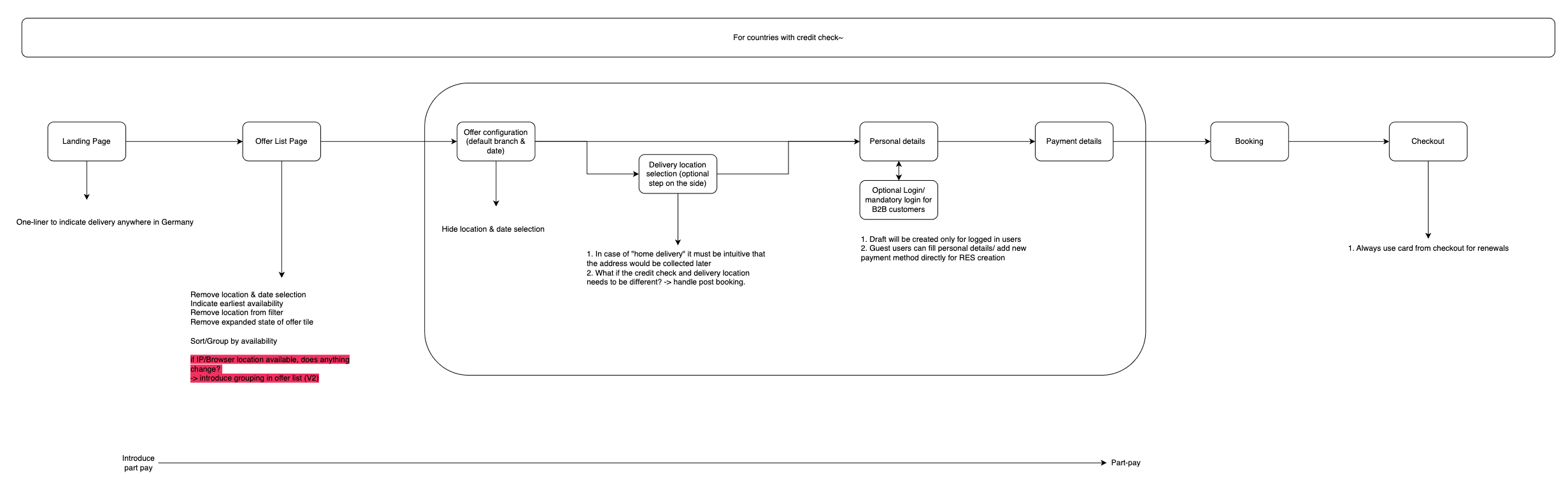
Guest Workflow
Push the user as close to the payment step as possible without entering personal information
Skip the location and availibility selection
Sync about fleet availibility
Skip login as a mandatory step
Include login alongside enter email
Pay at pickup
Today, a POA is setup if credit check is successful but payment fails, productise this flow.
Customer painpoints
Fleet availability mitigation
How does it look and feel to the users?
Feature snippets that made to the product
Refer a friend
Car of the month
Testimonials
Booking confirmation page
UX improvements that made to the product
Hypothesis 1:
Reducing the number of upfront decisions increases user engagement and understanding of the product, which in turn improves conversion rates.
Hypothesis 2:
Allowing users to explore the product without entering personal information builds trust, improves price transparency, and helps them compare with competitors—ultimately increasing the likelihood of booking.
Goal
Reorder the funnel such that location and date are collected at the end, allowing users to freely browse, configure, and compare cars, potentially improving user experience, engagement, and conversion.